Building website - coding from scratch or using CMS?
There are two main approaches to creating websites – writing code directly or using a content management system (CMS). So what should you consider before making a decision?
In this article, we will delve into the importance of responsive design in modern website development and explore the benefits it brings to businesses and users.
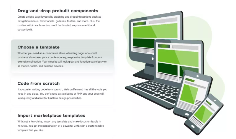
Responsive design refers to the approach of designing and developing websites that automatically adjust their layout and content to fit different screen sizes and resolutions. This means that a responsive website will look and function seamlessly on any device, whether it's a desktop computer, a smartphone, or a tablet. The key principle behind responsive design is to provide users with a consistent and optimized experience, regardless of the device they are using.
No more days of designing separate websites for desktop and mobile users. With responsive design, web developers can create a single website that adapts to different devices, eliminating the need for multiple versions of the same content. This not only saves time and effort but also ensures that users have access to the full range of features and functionalities, regardless of the device they are using. Whether it's browsing a product catalog, filling out a contact form, or making a purchase, responsive design ensures that users can seamlessly interact with the website on any device.
The evolution of mobile devices and their impact on web design has been a driving force behind the adoption of responsive design. As smartphones and tablets became more advanced and widespread, the need for websites to accommodate these devices became apparent. Users now expect websites to load quickly, be easy to navigate, and provide a visually appealing experience, regardless of the screen size. Responsive design allows businesses to meet these expectations and provide a seamless user experience across all devices.

Responsive design offers numerous benefits for businesses that are looking to create a strong online presence and reach their target audience effectively. One of the primary advantages of responsive design is improved user experience. By ensuring that websites are easy to navigate, visually appealing, and provide optimal functionality on any device, businesses can enhance user satisfaction and increase engagement. A positive user experience leads to longer visit durations, lower bounce rates, and higher conversion rates, ultimately contributing to the success of the website.
In addition to improved user experience, responsive design also plays a crucial role in search engine optimization (SEO). Search engines like Google prioritize mobile-friendly websites in their search results, as they want to provide the best possible user experience to their users. By having a responsive website, businesses can improve their search engine rankings and increase their visibility to potential customers. This can lead to higher organic traffic, more leads, and ultimately, more sales.
Another benefit of responsive design is cost-effectiveness. In the past, businesses had to invest in separate websites for desktop and mobile users, which required additional resources and maintenance. With responsive design, businesses only need to maintain a single website, reducing development and maintenance costs. This allows businesses to allocate their resources more efficiently and invest in other areas of their online presence, such as content creation and marketing.
User experience (UX) is a critical aspect of responsive design. When designing a responsive website, developers must consider how users will interact with the website on different devices and ensure that the design and functionality cater to their needs. A positive user experience is achieved when users can easily navigate the website, find the information they are looking for, and complete their desired actions without any hassle.
One of the key elements of a good user experience is a responsive and intuitive design. Responsive websites should adapt to different screen sizes and resolutions, ensuring that the content is readable and the navigation is easy to use. Buttons and links should be large enough to be tapped with a finger on a touchscreen device, and forms should be optimized for mobile input. By focusing on these design aspects, businesses can create a user-friendly experience that keeps users engaged and encourages them to explore further.
Another crucial factor in user experience is website performance. Responsive websites should load quickly on all devices, as slow loading times can lead to user frustration and high bounce rates. Optimizing images, minifying code, and leveraging caching techniques are some of the strategies that can be employed to improve website performance. By providing a fast and smooth browsing experience, businesses can ensure that users stay engaged and have a positive impression of their brand.
To create a successful responsive website, developers should follow a set of key principles that guide the design and development process. These principles ensure that the website adapts to different devices effectively and provides a seamless user experience. Some of the key principles of responsive design include:
1. Fluid Grids: Using relative units like percentages instead of fixed units like pixels allows the website layout to adapt to different screen sizes. This ensures that the content remains proportional and readable on all devices.
2. Flexible Images: Images should also be flexible and adapt to different screen sizes. This can be achieved by using CSS techniques like max-width: 100% to ensure that images do not exceed the width of their container.
3. Media Queries: Media queries allow developers to apply different stylesheets or CSS rules based on the characteristics of the device. By using media queries, developers can tailor the design and layout to provide the best possible experience on each device.
4. Mobile-First Approach: Adopting a mobile-first approach means designing and developing the website with mobile devices in mind from the start. This ensures that the website performs well on smaller screens and progressively enhances the experience for larger screens.
By following these principles, developers can create responsive websites that adapt to different devices and provide a seamless user experience.
Implementing responsive design in website development requires careful planning and execution. Here are some steps to consider when implementing responsive design:
1. Research and Planning: Before starting the development process, it is essential to research and understand the target audience and their device preferences. This will help in determining the breakpoints and design elements that need to be considered.
2. Wireframing and Prototyping: Creating wireframes and prototypes allows developers to visualize the layout and functionality of the website on different devices. This step helps in identifying potential challenges and refining the design early in the development process.
3. Development and Testing: Once the wireframes and prototypes are finalized, developers can start coding the responsive website. It is crucial to continuously test the website on various devices and screen sizes to ensure that it functions as intended and provides a consistent experience.
4. Content Optimization: Content plays a vital role in responsive design. It is essential to optimize the content to fit different screen sizes and ensure that it remains readable and engaging. This may involve restructuring the content, resizing images, and adapting the typography.
5. Continuous Optimization: Responsive design is an ongoing process. It is essential to continuously monitor and optimize the website's performance on different devices. Regular testing, analyzing user feedback, and making necessary adjustments will help in maintaining a seamless user experience.
While responsive design offers numerous benefits, it also comes with its own set of challenges. Some common challenges in responsive design include:
1. Performance: Ensuring that the website performs well on all devices can be a challenge. To overcome this, developers can implement techniques like lazy loading, optimizing code and assets, and leveraging caching mechanisms.
2. Navigation and Interaction: Designing navigation and interaction elements that work well on both small and large screens can be challenging. Using techniques like hamburger menus, expanding menus, and touch-friendly buttons can help in addressing this challenge.
3. Content Prioritization: With limited screen space on small devices, prioritizing content becomes crucial. Developers can use techniques like hiding less important content, collapsing sections, or using accordions to ensure that the most important content is easily accessible.
4. Cross-Browser Compatibility: Ensuring that the website works well on different browsers and browser versions can be challenging. Thorough testing and using CSS and JavaScript techniques that are widely supported can help in achieving cross-browser compatibility.
By being aware of these challenges and employing the appropriate solutions, developers can overcome obstacles in responsive design and create websites that provide optimal experiences on all devices.
Several tools and resources are available to assist developers in implementing responsive design effectively. These tools can streamline the development process and help in creating responsive websites that meet the highest standards. Some popular tools and resources for responsive design include:
1. CSS Frameworks: CSS frameworks like Bootstrap and Foundation provide pre-built responsive components and grids that can be easily customized and integrated into the website.
2. Responsive Design Testing Tools: Tools like BrowserStack and LambdaTest allow developers to test their websites on multiple devices and browsers simultaneously, ensuring a consistent experience across different platforms.
3. Responsive Image Optimization Tools: Tools like Cloudinary and Kraken.io help in optimizing and delivering responsive images efficiently, ensuring fast loading times and optimal performance.
4. Design Prototyping Tools: Tools like Sketch, Figma, and Adobe XD allow designers to create responsive design prototypes and collaborate with developers effectively.
These tools and resources can significantly enhance the efficiency and effectiveness of the responsive design process.
As technology continues to advance and new devices and screen sizes emerge, the importance of responsive design will only continue to grow. The future of responsive design lies in the ability to adapt to a wide range of devices, including wearables, smart TVs, and virtual reality headsets. Web developers will need to stay up-to-date with the latest trends and technologies to ensure that their websites provide optimal user experiences on these devices.
Additionally, the increasing focus on accessibility and inclusivity will drive the demand for responsive design. Websites will need to cater to users with disabilities and ensure that their content is accessible on assistive devices. Responsive design will play a crucial role in making websites more inclusive and ensuring that all users can access the information and functionalities they need.
Today, when mobile devices have become the primary means of accessing the internet, responsive design is no longer an option but a necessity. Businesses and organizations must prioritize responsive design to provide seamless user experiences and stay ahead of the competition. By understanding the importance of responsive design, implementing it effectively, and continuously optimizing the website's performance, businesses can create successful websites that engage users, enhance their brand image, and drive their online success. Embracing responsive design is a step towards building a strong online presence and meeting the evolving needs of users in the digital era.
Enter your search to find more articles by Web on Demand:
There are two main approaches to creating websites – writing code directly or using a content management system (CMS). So what should you consider before making a decision?
Do you consider it desirable to work from home? See how this type of work freedom allows you to live the lifestyle you choose.
Struggling with income as a fresh-started web designer? You invested much and now want to make smart steps for your business. How to play smart?
Looking for the right website builder and CMS?
Let's combine all the website builder pros in one place and provide you with a one-stop web development solution on demand!
You've heard about it and keep running into the term White-Labeling. But what does it really stand for? Let’s try to put it as simple as possible.
See how White Label business strategy can benefit you, regardless of whether you work independently or as a digital marketing agency.